Related sites:
Newsletter: Perspectives on Power Platform
Company: Niiranen Advisory Oy
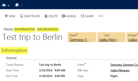
Today I was working on upgrading the customizations of a CRM 2011 org to CRM 2013 forms and restructuring the layouts to fit the new UI. This environment had a custom entity called “Travel Information”, which was used for storing details related to event travel for employees. Here’s what the form looked like when opening a test record:

Hmm, that’s three times the word “information” on the first few lines of the form. With further form sections for “Hotel information”, “Rental car information” etc. it seemed like there’s hardly any room for the actual information among all these labels claiming to be it. So, I decided to clean things up a bit.
When you create a new custom entity, you’ll get the first tab added on the form by default with the name “General” and quite often it remains the place where the commonly used and business required fields of the entity will get presented. It may be hard to come up with a very descriptive name for such a collection of fields, as was the case here with the “Information” label given to it.
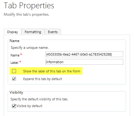
The form tabs can be used for expanding and collapsing the tabs to show/hide fields, but most of the times it will be unlikely that you’d want the first tab ever to be collapsed on the form. So why do we need the label there in the first place? Let’s navigate into the form customization UI and hide it.

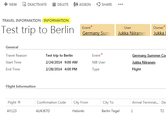
By clearing the checkbox for “show the label of this tab on the Form” we can clean up unnecessary text away from the form and help the users focus on the actual field contents instead.
In situations where there are more than one form for an entity (and the user has access to them), it’s necessary to show the form selector control at the top of the form. But in our example, there is only a single main form for this entity, so why does the form name “Information” still show up there?

With the default entities of CRM 2013 there has been a new naming convention introduced to distinguish between the legacy forms from CRM 2011 and the updated entity forms with the new layout and components. For example, the account entity will have a legacy form called “Information” and a new form called “Account”. If the user only has access to the latter one, then the name of the form will actually not be displayed there. Instead you’ll only see the name of the entity, thus avoiding unnecessary repetition like “Account: Account”.
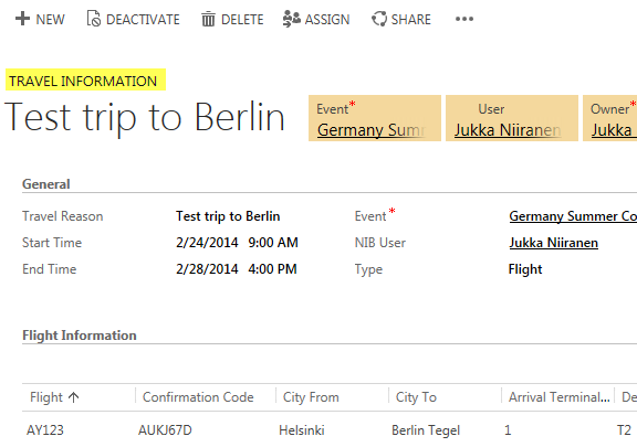
How could we achieve the same outcome with a custom entity? Simple: we’ll just have to do what the Dynamics CRM product team has done with their default entities and name the form exactly the same way as the entity. In this example, by updating the Form Name attribute found on the Form Properties dialog from “Information” to “Travel Information”, this same behavior should kick in when CRM loads up our custom entity form.

Yup, no more form names displaued on the form. As we can see from the end result, we’ve now managed to remove redundant labels from the form quite nicely, leaving only the entity name visible above the primary name field of the entity.

Hi Jukka,
Do you know if changing the form name to the entitiy name also works for localized entities?
/Allan
Allan, I think the decision on whether to show the form name or not is evaluated when the user opens the form, using his or her language settings. If the localized name of the form matches the localized name of the entity, the form name won’t be showed, based on my tests.
[…] post Information Overload: Cleaning Up CRM 2013 Forms appeared first on Surviving […]
[…] Information Overload: Cleaning Up CRM 2013 Forms […]
[…] entity will have a new form labelled “Account”, as an example. (By the way: check this tip for optimizing your form naming […]
[…] entity will have a new form labelled “Account”, as an example. (By the way: check this tip for optimizing your form naming […]