Related sites:
Newsletter: Perspectives on Power Platform
Company: Niiranen Advisory Oy

CRM 2013 introduced the first big change in the navigation logic of Dynamics CRM since version 3.0 in 2005. We went from a hierarchical, popup window driven UI with many ERP-ish menus to a more modern experience of a single window app with touch optimized navigation bars and a reduced number of menu options visible to the user at any given time. Hopefully many of you have already had the chance to try out the new flow UI, in a CRM Online trial instance, for example.
When big changes are introduced to the user interface of an application, it always takes a while for the existing users familiar with the previous interface to get adjusted to the new ways to perform the same underlying actions in the application. There was a very interesting piece published a while ago where a UX designer having worked with the Windows 8 Modern UI (formerly known as Metro) shared his opinions on the impact to the users and one possible rationale behind Microsoft’s decisions on revamping the world’s most popular OS:
“Familiarity will always trump good design. Even if something is vastly better, if it is unfamiliar it will be worse. That’s why people act like a unicorn was murdered every time Facebook releases a new redesign. The Windows 7 start menu IS better because it is familiar. We’ve used that design paradigm for the last 20 years. Metro is going to take some getting used to.”
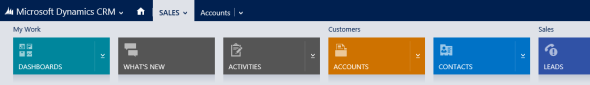
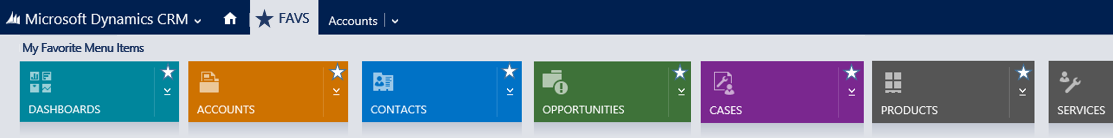
Just like Windows 8’s new UI probably wasn’t perfect in the initial release, there are some areas in the CRM 2013 navigation features that might work better with a little fine-tuning and enhancements to the functionality. For example, one feature that I’ve always promoted to the CRM Outlook client users is leveraging the favorite folders (Shortcuts in newer versions unless you’ve disabled the solutions module in Outlook). No amount of role tailoring can replace the convenience of allowing users to select exactly the 5 menus that they most frequently require during the day. Wouldn’t it be awesome if there would be a similar feature available in the more modern web client UI of Dynamics CRM 2013? Something a bit like this:
“Cool! I want it, how can I get it?” Easy: all you need to do is sign in at Microsoft Connect with your Microsoft Account (what used to be Windows Live ID), navigate to the Dynamics CRM Suggestions site and vote for the feature suggestion on having a Personal Navigation Bar.
Will this guarantee that the feature will be included in the next Dynamics CRM version? Of course not. Will it make any difference to vote on the items on Connect then? Yes, it will. While only a fraction of the feature suggestions posted on Connect can ever get the chance to become a release item in the actual product, the suggestions that gain more than a couple of upvotes will most certainly have a far higher likelihood of being raised up onto the list that the Dynamics CRM product team will use when evaluating the priority of possible future features.
 While you’re logged in, don’t forget to use the search feature on the site to look up other suggestions that touch areas of the product which you’ve thought to be in need of minor adjustments or features that are currently lacking from Dynamics CRM. Since we’re discussing the new navigation in CRM 2013, here’s a few items I’d recommend you to take a look at and vote for, if you consider them to add value into the Dynamics CRM product for a significant enough share of customers:
Well, for the last one there’s actually a nice workaround you can apply already today. Still, since the vast majority of users will never now about these power users tips and an unfortunately large share of CRM organizations will likely not have the top Navigation Bar items nor Command Bar items customized due to the system admin’s lack of knowledge on great free tools available for Dynamics CRM customizers, the importance of the default settings and out-of-the-box functionality of a software product like Dynamics CRM cannot be overemphasized.
If you’ve got any CRM 2013 navigation related ideas that you’d like to see implemented in the next release, then please do the following: 1) perform a search on MS Connect to see if anyone else has already logged in the suggestion, 2) if not, create a new suggestion describing the “what”,”why” and “to whom” behind your idea, then 3) leave a comment on this blog post with a link to the suggestion, so others interested in the topic of improving the CRM user experience can also easily find them and vote them up on the list.

I guess I’ll start the commenting with an example of a great suggestion to improve CRM 2013 user productivity: Enable Right-Click on Lookups to open record in new window/tab https://connect.microsoft.com/dynamicssuggestions/feedback/details/819397/enable-right-click-on-lookups-to-open-record-in-new-window-tab
That is a great idea and one of the main pain points in the 2013 navigation. I’d also love the ability to have and ‘x’ on the window that takes you back to the last page just like in OWA.
Great way of grouping all these together! I know that Microsoft actually looks at these suggestions because the export for re-import that was introduced in CRM 2011 was one of those features!
Awesome post. I upvoted all the suggestions and think they all have merit. Here’s kind of a navigation type of suggestion (multiple clicks to navigate the social pane), I made a connect suggestion here:
https://connect.microsoft.com/dynamicssuggestions/feedback/details/819543/improve-activity-notes-social-pane-visibility-by-adding-combined-feature
Great suggestion, Joe! Indeed the tabs approach in the current Social Pane doesn’t yet reach the full potential of quickly showing “what’s going on, if anything” regarding a CRM record. As a system customizer, having to choose per entity which tab the form defaults to carries the unfortunate burden of either de-emphasizing Activity Feeds (/Yammer) or activity tracking.
Most companies still find the email and appointment tracking to be the most practical way to ensure information regarding customers is shared across the organization. As a result, changing the default to Activities is in many cases the sensible thing to do. Since you want to deliver a consistent user experience across entities, the choice tends to get carried over from accounts & contacts to also other key entities, which again requires you to sacrifice the accessibility of the Activity Feed posts.
I bet many customers would be willing to sacrifice a few filter options (well, the Social Pane already reduces the activity view filters considerably) in exchange for a single glance of the latest actions regarding a record, regardless of whether they are interactions with other parties (activities) or updates made to current or child records (activity feed posts via custom workflows).
(I also posted my comment on the Connect item.)
Thanks Jukka! We actually do exactly what you suggested in terms of only using Activities… but it is unfortunate because Posts and Notes have their benefits as well. Appreciate the feedback.
Here are 2 other important Navigation suggestions:
1. Customize Global Quick Create Menu (not my suggestion, but a great one): https://connect.microsoft.com/dynamicssuggestions/feedback/details/807946/crm-2013-global-create-menu-customization
2. Customize Entity Colors in Navigation and Business Process Flow: https://connect.microsoft.com/dynamicssuggestions/feedback/details/808622/add-support-for-customizable-color-modification-by-entity-type-helps-users-navigate-more-easily
Especially the ability to restrict entity visibility in the Global Quick Create menu would be a feature I wish the product had already today. I really see the Quick Create forms as a user experience component that is quite often independent from the need to create the records from any point in the application hierarchy. For example, when adding line item style child records, in 99% of the cases you’ll want to enable Quick Create forms but you’d never really add those records from outside the parent entity form.
Colors, yes, that’s a frequent request as well and certainly would be a welcome feature for sitemap customization. Going down that path, though, you soon end up in the whole custom branding territory which seems to be an area that Microsoft has consciously tried to stay away from. I hope there would be a happy path found between the two extremes of no support at all vs. totally custom styles for the CRM UI.
Sometimes the CRM navigation experience can also be improved via open source community solutions. Here’s an interesting new solution from Jason Lattimer that allows showing a persistent list of navigation links to form tabs or related entity record views in the CRM 2013 entity form footer: https://crm2013quicknavigation.codeplex.com/
Also remember to check out the Windows 8 style solution of CRM 2013 Quick View Menu released earlier: https://crm2013quickviewmenu.codeplex.com/
[…] the CRM 2013 navigation options should be developed further in upcoming releases, be sure to review these links to feature suggestions on Microsoft Connect and cast your vote for the ones that you feel would help your organization’s users to be more […]
We are xRM-developer since a long time.
The new navigation interface and the ribbon replacement in CRM 2013 are more than one step back. some month before some MS guys told me that it is just bad for “old” crm user, new user will find it good. But now I have customers online and onpremise – and not a single guy – have the feeling it got better. navigation in more complex environments is bad, more than bad. A tree may be an old, maybe boring idea – but is much better than everything 2013 delivers. we are not able to migrate our customer to 2013 if we do not want to lose them.
All people at MS who have to responsible for that interface should use it in a daily business. The will change their mind.
I’m so fed up with the CRM 2013 desktop navigation that I’m offering $5000 for the best design anyone can come up with. I love the ideas presented above. I hope someone will scope them out in a show-and-tell fashion.
Details on the design contest:
http://rocktonsoftware.com/inside-rockton/blog/rockton-blog/2014/05/28/crm-2013-navigation-contest-win-$5000
For those who click on the direct links to the suggests and get a “Page not found” error, you have to go to https://connect.microsoft.com/directory/?keywords=CRM or https://connect.microsoft.com/ and search for “CRM” first and click “Join”.
Related records navigation is completely wrong. You must go ‘out’ or ‘above’ the open record, up to the top-level menu (the same screen area that brought you into the record), to find related records. This is hopeless. It should be somewhere near the record itself!
CRM 2013 UI is a massive turn-off for all that see it. HTML flow & Modern wins, UI loses. Time to re-assess your approach MS, you are hurting your products.
Totaly agree with Chalky MS introduce bad change in UI. CRM 2013 UI is step in wrong direction.
A follow-up question to all of you who say that “CRM 2013 UI is bad”: is this specific to the task of navigating between different entities or do you dislike the presentation of data in the user interface as a whole?
From my experience, the initial reaction from people to the traditional “ERP style” UI of CRM 2011 versus the new design of CRM 2013 is very clear: a modern CRM application should look more like 2013 than 2011. The extremely hierarchical nature of the traditional Dynamics CRM application was quite often alienating to the casual user, and the Ribbon didn’t work quite as well there as it does with standard Office apps. If the users could choose, most of them would want to *view* the customer information in an environment that resembles Dynamics CRM 2013. Also, from a business process automation perspective, I think the Business Process Flow is almost unanimously considered a better approach than a series of conditional dropdown fields on the form or automated task reminders appearing on your ToDo list.
What I’m interested in understanding is: if there was A) a more efficient way to move between entities than the current top Nav Bar and B) a more logical way to access the records related to the currently open record, would this solve ~90% of the issues that are causing negative feedback from Dynamics CRM users? Or is there some other area in the application besides the navigation part that would also need a re-design to deliver the kind of user experience that you expect from a modern CRM application in the year 2014?
I have a query related to this.. Can I use the case form UI of older CRM 2011 aftrer upgrade to CRM 2013?
Hardik, the old UI will no longer be available after the upgrade. Your old case form layout will still be present in the system (including your custom fields) and you could choose to continue using this instead of the new modern form with the Social Pane and 3 column layout, but the CRM application navigation and UI controls will use the CRM 2013 style.
Hi I need to open menu item from tile navigation in new window? Help will be appreciated.