Related sites:
Newsletter: Perspectives on Power Platform
Company: Niiranen Advisory Oy
Last week I had the privilege to talk at the Dynamics CRM Finland User Group meeting in Helsinki (quick recap available in Finnish here). When planning on what topic to choose for my presentation, I tried to think of something that would appeal to a wide audience of CRM users – both experienced consultants as well as key users who might still be relatively new to the product.
The common denominator for the group was, as the name suggest, that we’re all CRM users in one way or another. In this role we interact with the software in a variety of different ways, most likely several times during the course of a typical working day. As information workers, systems like CRM are our tools to get the job done. How effectively we succeed in this is largely affected by how much cognitive effort is needed to use these tools to shape the expected output.
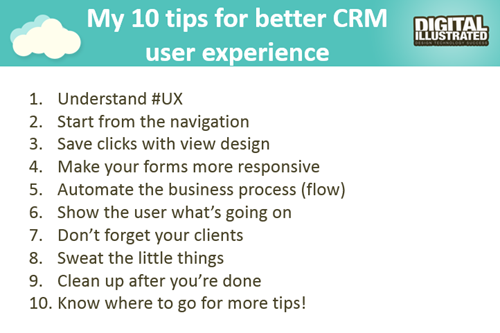
So, I decided to talk about the many ways how we can sharpen our saws when it comes to Dynamics CRM. While every CRM environment is ultimately different from one another, due to the business processes we manage with it, the systems it integrates to, the user groups working with the application and so on, I believe there are still general design guidelines that apply to basically any organization using Microsoft Dynamics CRM. My presentation, “10 Tips for Designing a Great User Experience in Dynamics CRM“, introduces many of these guidelines that I personally try to follow when designing CRM solutions for customers. You can view the embedded presentation below, or if the content is not showing, then go and have a look at it on SlideShare.
While UX has always been an important piece of the puzzle when trying to convince business users that using a CRM system can actually deliver tangible benefits to them, rather than just serve as a management tool for keeping track of what the employees are doing, the launch of the Dynamics CRM 2013 version has really heightened the importance of designing solutions with a polished user experience. This is due to the fact that the refreshed user interface and new customization points available in the UI can be leveraged to deliver a much more usable business application than the CRM systems of the past. But: you also need to plan the flow of user interactions with much more attention to detail, because sloppy customizations will now stick out like a sore thumb.
The good news is that many of the new details in CRM 2013 (and CRM 2015, too) are easy to configure once you know the role of each platform component. You can do so much these days without writing a single line of custom code that the system customizer can easily have his or her plate full of CRM enhancement ideas to implement without ever consulting a .NET developer. That’s why it’s also good to think in advance how to prioritize the areas into which you invest your efforts. This Top 10 list of mine provides one example of such a tool, to help in identifying the low hanging fruit when it comes to making your CRM users happier and more productive with the system. If you have any topics on your mind that I forgot to include on my list, be sure to leave a comment below!
Oh, one more thing: if you’re a Microsoft Dynamics CRM user in Finland and would be interested in networking with other fellow CRM professionals, I’m glad to announce that there’s now a new Yammer network available for you: Dynamics CRM Finland User Group. Whether you’re from a customer or partner organization, please feel free to sign up for this network and come join the planning for future events and other ways to share Dynamics CRM knowledge and experiences with peers. Tervetuloa!


The single best post I’ve ever read on dynamics CRM usability. Great points made and solid examples too. It’s crazy how often these fundamentals are overlooked, especially view design – as a Dynamics CRM trainer, I couldn’t agree more that requiring a user to open a record just to check it’s the correct one makes for an awful experience as is so difficult to justify. The majority of these simple fixes also happen to be the cheapest changes you could ever make as far as development time is concerned.
Thanks for sharing, I sincerely hope these become the minimum standards for any implementation.
Thanks for your feedback, Franco! Yes, the paradox really is that these tiny details tend to be the ones that very rarely receive adequate attention during the CRM implementation and development projects. Usability is not a “feature” and you can’t achieve it by adding requirements like “system must be easy to use” onto your specifications. In the rush of getting big new functional areas delivered to the client, it’s far too easy to just configure the CRM data model to contain the necessary entities and fields, yet neglect the whole UI layer and deliver a system where the flow of the real life processes just doesn’t make any sense for the user.
For anyone interested in the topic of user experience and Dynamics CRM, I’ve also covered the topic in my four part article series on the Dynamics CRM Platform Evolution. Specifically part 3/4: Customizing CRM Today.
You’re very welcome Jukka. I think think the columns we include in views are all the more important now users can easily filter – provided the columns exist in the first place! For any activity, users will generally want to filter with a combination of owner, due date and priority
One further suggestion to improve views would be consider which fields you make searchable in each entity’s quick find view. For example, will users need to find accounts by contact name, postcode, phone number, email address? Or cases by customer
I second Franco’s comment. This is the best tips that I ever came across! I am in the situation that my users absolutely hate the number of the clicks that it has to take to access one single record.
So happy that I found your site!
Cheers,
Sue
[…] Instead of taking the shortcut and doing a quick content merge, I recommend investing a bit more time and effort in planning what’s the best way to present the data and how to make it as easy as possible for the users to interact with it through the UI. If you need some ideas for improving the user experience of your Microsoft Dynamics CRM environment, take a look at my previous post that listed 10 tips for designing a great user experience in Dynamics CRM. […]
Agree very much about the attention to detail and Franco’s comment about search-ability. Would mention not forgetting “special” views like associated records, lookup, search results etc.
Perhaps might add using a design that’s as **consistent** as possible (labelling, layout, icons, menus, dialogs, terminology) in different but related areas. [something that in my view seems to have gone out of the window with the OotB product since MS started the rapid release cycle and so requires an increasing effort to straighten…] And checking for an OotB feature before you add one – quite a few aren’t fully surfaced OotB.
Also a suggestion I’d be interested to see if you agreed with or not:
– “Never customise the OotB instance of anything if you can possibly avoid it” (save a copy and customise that – then disable/restrict access to the OotB version).
[It has pros and cons of course. The pro’s are that your work isn’t messed up by Microsoft’s changes every 6 months and you’ve still got the unmodified OotB version to see how they were intending that cool (or not) new feature to work. The cons are that you need to be much more on the ball to discover the cool new feature in the first place and they may take significantly more effort to deploy to your customised versions.]
Finally perhaps something on approach? I prefer quite an iterative approach to the way things are presented (people don’t know what they want until the see something close to it). On the other hand I think it can be a bit of a mistake working this way with the data model (particularly if there is little longer term “road-map” for the system). Sometimes those two can be rather in conflict…
Good point about consistency there, Simon. For example, it’s very common to run into environments where a default entity was renamed to something else, but this has not been propagated to all the places where the term appears: entity messages, field names, field descriptions, form labels, view names, Command Bar buttons… Another thing that unfortunately is not very well in line with the OoB UI are the form layouts, which differ wildly across entities and don’t communicate a clear purpose of information placement, leaving the users scanning through long forms, searching for fields. Oh, and that visual scanning will be all the more difficult if you haven’t been consistent with the terminology and used the terms that the users would expect to find in the application.
As we can see already from this quick example, in user experience design all the components of the application are very much intertwined. You can’t just change one part without considering the impact to other areas – because the users WILL notice the gaps, even if you yourself initially don’t. I have to agree with your criticism to some extent that the current Dynamics CRM application isn’t always being developed with sufficient attention to A) the details and B) the big picture, but rather as individual features. Sure, it is awesome to get so many new possibilities introduced into the platform at such short intervals (keeps CRM geeks like us very busy at least!), but the “clean up after yourself” stage in the UX design principles is in danger of being neglected with this rapid release cadence.
I agree with this but we are limited by crazy constraints by Microsoft who limit the ability to customise some of the important default views. See my Connect feedback: https://connect.microsoft.com/site687/feedback/details/1008977/price-list-item-and-unit-lookup-views-do-not-provide-sufficient-information-and-are-not-customisable
Caratacus, you’re very much correct about the irritating limitations that these views cause. In fact, I’ve written a whole blog post on the Price List Item limitations. It also contains a link to an older Connect item that has much more upvotes, so I would suggest using that one instead, to ensure that there is sufficient exposure to this request, in order to make it easier for the CRM product team to justify internally why investments should be made in this area of the existing platform features.
[…] CRM platform to present data in a format that’s easier for end users to consume. (Check out my 10 tips for better CRM user experience for more discussion on that […]
[…] Synchronization vs. Tracking: Understanding Activity Management Options in Dynamics CRM Time Travel with Workflows: Accessing “Before” and “After” Values 10 Tips for Designing a Great User Experience in Dynamics CRM […]
[…] a reflection of the data model. I’ve illustrated some of these design aspects in my 10 Tips for Designing A Great User Experience presentation, which hopefully can give an idea of how the system customizers can do their part in […]