Related sites:
Newsletter: Perspectives on Power Platform
Company: Niiranen Advisory Oy
Those who have worked with Dynamics CRM for a longer period of time will remember how the user experience delivered by the platform has evolved over time: from an Office style, data entry focused, Internet Explorer popup window application into the clean and modern Dynamics CRM 2015 application that works on any device and aims to present the maximum amount of relevant information to the user with the minimum amount of clicks. There was a time when CRM didn’t exactly seem like something that was designed with the needs of the end user in mind, but this direction changed quite drastically from the CRM Online December 2012 Service Update onwards, as Microsoft started to redesign the experiences they wanted to deliver for the users of their business applications in the new era where mobile, social and cloud were quickly becoming the most dominating forces in the world of enterprise software. Not forgetting the consumerization of IT, which had shown people that not every app used in a work context needed to look like a 90’s ERP system.
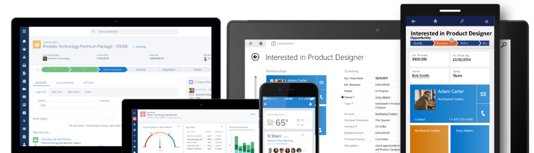
I have covered this transition in quite a bit of detail in my four part article series titled “Dynamics CRM Platform Evolution”, which I’d recommend you to read through for understanding the practical impact of moving from the “first era” of MS CRM v1-v5 onto the current era of largely CRM Online focused rapid product iterations. One of the points I raised in the article was that not all the CRM software providers in the market had chosen to follow a similar path of introducing a big bang revolution to their application. Unlike Microsoft, Salesforce.com had instead opted for an evolutionary path that had seen their application UI remain almost unchanged for the main components and layout, as depicted in the image below.

While being wildly successful in becoming the “next CRM application” after the 90’s generation of Siebel style, on-premises enterprise CRM suites had began to slide out of the limelight, Salesforce also began to receive a growing amount of criticism over the legacy that its user interface had accumulated over its history. The question of “Why doesn’t Salesforce upgrade the UI/UX of its core CRM web app?” did seem more and more valid, especially when competing products like Dynamics CRM were transforming the user experience that one could expect from a customer relationship management application. Well, finally in late August 2015, Salesforce announced that their next era of CRM UX would arrive in the form of the new Salesforce Lightning UI.
First of all, congratulations to the product team behind the Lightning UI on the launch! Pulling off a major redesign like this is bound to be a massive task and I’m sure in many ways the work has only begun now, but it’s still definitely an achievement worth celebrating. As many of you may have noticed, in my day job I work exclusively with Microsoft Dynamics CRM, so whatever I write here about a competing CRM solution is not going to be 100% objective. For that I apologize, but the point of my post isn’t to bash Salesforce but rather to analyze some of the trends in CRM software in general and also reflect back a bit on what has taken place in the world of Dynamics CRM during the past few years.
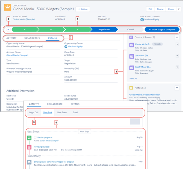
But first, I need to just get something out of the way. Damn how these two apps look alike! Here’s the brand new opportunity form on Salesforce Lightning UI, a.k.a. Opportunity Workspace:
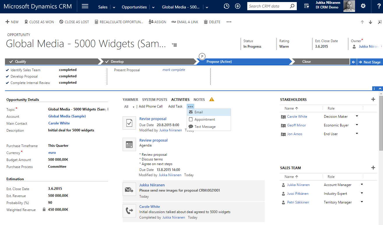
…And here’s how the opportunity form on Dynamics CRM has looked like pretty much since the 2013 version:
Notice any resemblance? Let me help you out a bit by listing the first five things that come to my mind from the Salesforce screenshot:
Yeah, of course these both are applications for managing your typical sales opportunity information with activities and contacts, so its understandable that the concepts used in the default screens would be unlikely to radically differ from one another. Still, contrasting Lighting UI with the traditional Salesforce UI and looking at how close to the now familiar Dynamics CRM form layout, UI controls and especially the Business Process Flow feature the Salesforce product team has ended up with their design is, well… Quite remarkable in my opinion. Not a bad choice by any means, and also serves in validating the direction that Microsoft’s team took when overhauling their application’s UI a couple of years ago.
Aside from the similarity to Dynamics CRM, there are plenty of nice looking designs and features included in the Salesforce Winter ’16 release notes. Some of them are about filling the functional gaps to Dynamics CRM (list view charts known from CRM 2011 make an appearance here), others are borrowing concepts from the more recent CRM apps out there (Kanban style opportunity board used in Pipedrive, Pipeliner et al., as well as SalesFlow for Dynamics CRM), but many of the release items seem to be focused on fine tuning the application usability and removing unnecessary friction from common tasks that sales people need to perform on a daily basis. Rather than just slapping on a new field layout and updating the icons, it does seem like the user experience of Salesforce will change quite dramatically with Lightning. Of course the true UX can only be evaluated once a live version of the application is available for testing how it truly feels like to use the app, but at this point it looks like a major step forward.
Introducing a new application user experience to new users who don’t have prior experience of the product will always be far easier than forcing it upon the existing user base. While few people would say that they don’t want a nice & easy UI, the reality is that resistance to change is always a factor when dealing with human beings. When it comes to business software especially, disruptive changes are at the very bottom of the want list for the majority of people who are responsible for ensuring that information systems deployed for managing the core business processes of their organization keep on churning out the expected results. What’s going to happen when a CRM system jumps from evolutionary releases to revolutionary changes instead?
The one important thing to keep in mind is that changes like this never take place overnight. Migrating over all the functionality that vast application platforms like Salesforce of Dynamics CRM have accumulated over time isn’t something you can get away with a single big bang release. With Microsoft there was a preview version of the new UX introduced with the Online only Polaris release, launched almost one year ahead of the actual major release of CRM 2013 (v6.0). Initially only five core entities were updated to the new “refreshed” forms, and even today the latest v7.1 still contains lots and lots of entities and menus that follow the old Ribbon based user experience. So, three years later the work isn’t even done for the Dynamics CRM product team in renewing the platform, which means that the end users and system customizers need to cope with a somewhat mixed application environment. The platform legacy becomes most apparent with the new mobile client applications that don’t support the old product architecture, resulting in features like marketing lists or connections not being available on the modern client versions. Sure, life is much, much better with the new UX, but it has also introduced some new complexities into the product.
In the case of Salesforce, the story sounds to be somewhat similar, as not every area of their platform will be Lightning enabled right from the start. The Service Cloud will not yet be updated, nor will features like forecasting, orders or person accounts. In moments like these it’s always interesting to see how companies prioritize their development efforts, as they are likely to indicate either the observed level of usage for certain features of their products, or alternatively possible future plans to scrap something old and rebuild it from the ground up. If you’re working as a consultant that advises customers on what features they should take into use or invest in developing for their CRM systems, the messages conveyed by the application vendors via the frequency of updates to certain functional areas of their products are signals you’ll most certainly take into consideration when deciding on what strategy to recommend to your client base.
With 150k customers and millions of users, it’s going to take a while before Salesforce will have safely moved each and every one into the Lightning world. In fact, based on the statement by Sara Varni, senior VP of marketing for SFDC Sales Cloud, this milestone may never even be reached, since Salesforce will support the classic experience “indefinitely”. In the oldskool settings of on-premises servers, the way this could have been handled would be for the customers just sticking to an older version of the software and not deploying any updates. When you’re the grandaddy of SaaS platforms, things are obviously a bit different and supporting older versions will require more than just accepting support tickets for ancients releases of your software. With CRM Online, Microsoft has previously been pretty strict on getting every customer to move on to the latest version via the CDU (Customer Driven Update) program, but lately they’ve also changed their update policy to allow skipping the bi-annual releases and updating only once per year. As SaaS products become a more mature market, I bet we’ll be seeing a growing number of options for customers to choose which versions to use, which features to activate and when to schedule these changes to take place.
The way Salesforce chose to build their next generation UI is different from the path that Microsoft took. While Dynamics CRM 2013 introduced both the new web client experience as well as the “MoCA” tablet client application as separate experiences (followed by the refreshed mobile app in CRM 2015 Update 1), Salesforce decided to first build the Lightning framework for their Salesforce1 mobile app and then scale it out to the PC screens. As a result, the screenshots that we see in the Winter ’16 release notes look very much like a mobile app placed onto the screen of an iMac. While you could in theory also use the Dynamics CRM for Tablets app on a Windows 8/10 laptop, the users will certainly almost always end up choosing the Dynamics CRM web client designed for interaction with mouse & keyboard rather than touch optimized “Metro” experience.
I think this will be one of the most interesting design choices to keep an eye on when it comes to user reactions to the new Salesforce Lightning UI. Regardless of all the recent Universal Apps hype that Microsoft has been building up alongside the Windows 10 release, I’m personally not quite convinced yet that you can deliver a great UX with a single app that needs to scale from 5″ touch screens to 27″ desktop monitors. As a result, I’m also not a big proponent of the “configure once, deploy everywhere” slogan used in reference to the Dynamics CRM mobile apps, since I’d rather see CRM applications truly optimized for the device and use case in question. However, if Salesforce can pull this off with Lightning, then perhaps Microsoft has been right all along with their OS strategy and the application teams should now move faster towards unifying the client side of things.
When it comes to products like Dynamics CRM or Salesforce, one of the key reasons why they are being so widely deployed across enterprises today is the ability to customize them to align with the business processes specific to the customer organization. They are not only replacing legacy CRM suites but also capturing an ever larger share of the market that used to belong to custom developed business software, since using a customizable application platform delivered from the public cloud can really drive down the TCO quite significantly. But if the CRM applications are now reaching towards an even more polished user experience in performing common tasks with sales, marketing and service records, what will happen to supporting the business specific scenarios that are more unique than what pre-built application features can cover?
When Microsoft launched the Dynamics CRM 2013 version with the refreshed UI, they didn’t only add more features into the already crammed product, but rather they took away some configuration options that had been previously expected from the platform. As the saying goes about the goal of design work, “perfection is achieved not when there is nothing more to add, but when there is nothing left to take away.” That may very well be true when designing a product to serve a specific set of tasks, but it may not resonate so well with a toolkit used for crafting these end products. Limiting the options shown to an end users is different from limiting the options available to the designer of the final solution that the user will be exposed to.
How do such limitations show up in everyday life with the latest Dynamics CRM version? Today we have inline quick create forms for effortlessly adding activities for records, but we can no longer choose if we want to record a future phone call activity instead of a completed one. We can use an editable grid for adding line items into opportunities, quotes and orders, but we can’t configure these grids to contain those fields that the business logic would require to be recorded onto these line items. The price of added convenience for some is therefore resulting in the reduced usefulness to others. Looking at the Salesforce Winter ’16 release, it’s apparent that also here the polished UX will be come at the cost of reduced options. For example, there will be a brand new, great looking Home screen offered for sales users, but the components shown in it cannot be customized at this time.
Is there an inherent conflict between the needs of the application end user and the platform customizer? I don’t believe this is necessarily the case, but it is obvious that there are trade offs in building something that works great and building something configurable when it comes to the allocation of development resources for these software products. As the release cycles get faster and faster, the pressure for getting a new feature out there can mean there’s no time to perfect the first version into something that will meet the needs of all user groups and align with the rest of the platform functionality. The real question is, will the features be made more customizable in the subsequent releases, or will the requirements be pushed down in the backlog when the demand for more new features arises?
When discussing the user experience of applications that are not commodity services like email but highly business specific process management tools (at least when properly deployed), it’s very important to understand what the final UX really consists of. It’s not only about having the slickest UI controls for working with the data, the flashiest graphics for visualizing the sales pipeline or most creative layouts for presenting different data sources on one screen. At the end of the day, the users need to feel like they can easily accomplish the tasks they are responsible for, with the help of the application – not despite of it. Understanding what exactly those tasks are and what pieces of information are relevant to the process of their completion is something that requires careful analysis conducted at the organization deploying a new CRM solution. Failure to do this will quickly wash away any value that the software features could have potentially delivered to the organization.
As today’s CRM platforms become more and more sophisticated with the functionality and data presentation options available, the design work of those who configure the customer specific solutions also needs to be aligned with the increasing expectation levels for application usability. It’s still not rocket science, but it does require a greater attention to detail than the earlier, more primitive business applications where the UI was essentially a reflection of the data model. I’ve illustrated some of these design aspects in my 10 Tips for Designing A Great User Experience presentation, which hopefully can give an idea of how the system customizers can do their part in building CRM systems that the business users will find great value in – a Useful Experience, if you will.


[…] The two horse CRM race and competitors pushing each other to innovate (and imitate) […]
[…] The irresistible force of great user experience in CRM applications blog post by Jukka Niiranen. The definitive comparison of Dynamics CRM and Salesforce Lightning UI. […]