Related sites:
Newsletter: Perspectives on Power Platform
Company: Niiranen Advisory Oy
Last year the Microsoft Word Partner Conference gave us a first look at the Activity Feeds solution and other R7 feature enhancements. This year in WPC 2012 we got a taste of things to come in Dynamics CRM on not just one but two client UI’s. Although the Metro CRM app is surely a more significant step in the long run, the updated browser UI will initially have an impact on a much wider user base. That’s why I decided to blog about these news first before jumping into the world of Windows 8.
The screenshots in this post are taken from the recording of the WPC session titled Microsoft Dynamics CRM — Now and in the Future, in which Bill Patterson presented the future roadmap of Dynamics CRM. We’ll be getting an updated Release Preview Guide soon which hopefully goes into more detail about the changes and new features, so consider this just a sneak peak into what’s coming in the next Dynamics CRM update.
After the R8 / Q2 2012 release contents on the browser front were rescheduled, we’ll now be getting visible changes also on the Internet Explorer user experience in the Fall 2012 release (in practice the Q4 2012 Service Update). The new “Refresh” UI will take the classic browser experience closer to the Metro look & feel, but it is not the same thing as the Metro app. Point & click mouse interaction is still the focus here, although with cross-browser support you will at least theoretically be able to run this on a tablet with a touch UI.
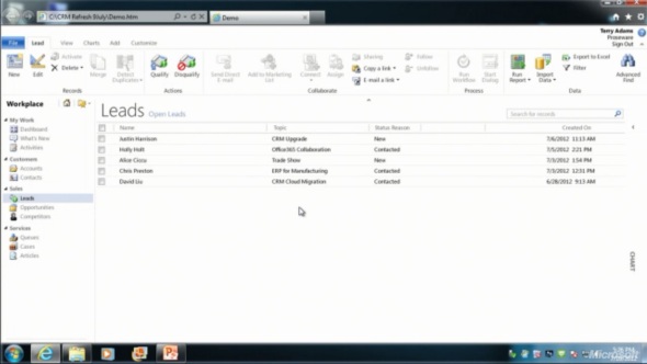
The changes in the main screen of Dynamics CRM browser client do not appear to be functionally significant, rather just small tweaks in the colors, fonts and other details. We’re moving from the Vista style Aero UI into a simplified, flat Metro UI, which will be visible in all Microsoft products very shortly.

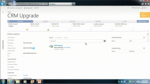
The entity form windows will experience a much more significant update. Please note that one of the focus areas in the Dynamics CRM roadmap for Fall 2012 is developing the application functionality specifically for opportunity and case management, so I expect these changes will not initially impact all the entities. The demo at WPC covered lead and opportunity forms, below is a screenshot of how the lead form appears in the “Refresh” UI:

Wow! We’ve come a long way from the CRM 2011 UI. Where should we start with going through the changes?
Let’s take the ribbon first, or more specifically the lack of it. Although the main window of CRM will still present the full application ribbon, at least on the lead & opportunity forms the ribbon will be minimized by default. Clicking the “More” button will presumably reveal the ribbon, but we didn’t see this in the demo, because the intention of Microsoft is to hide it away as much as possible.
“Hey, didn’t we just get the ribbon 1.5 years ago?” Yes, we did, but it doesn’t fit with the Metro design principles anymore, which state: only deliver the right information to the user at the right time, don’t overwhelm them. Touch UI on tablets and phones makes this even more important, which is quite easy to understand. For the power users (most of the readers of this blog, I’d imagine), the wealth of functionality presented on the ribbon must have felt like a welcome addition back in Office 2007 or CRM 2011, but this doesn’t necessarily mean it’s the right design choice for a CRM application. Results of the usability research Microsoft has conducted can be summarized in the following quote from Patterson:
“Ribbon is great for the power user, but the everyday user just wants the file menu back.”
Well, that’s it then. RIP ribbon 2011-2012, it was nice to know you. While the reality may not be quite as black & white, anyone designing solutions on top of the XRM platform should definitely take the inevitable fate of the ribbon into consideration.

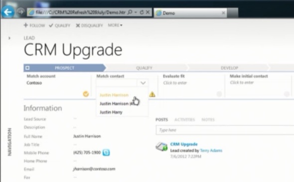
If we don’t have the ribbon there to guide the user anymore, then what can we use instead? The answer is: processes. What is called the Process Driven UI in the development roadmap will in practice manifest itself as a graphical, interactive process stage indicator on the top section of the entity form.
According to Patterson, the new UI is built on the Dialog Process foundation established in the original CRM 2011 release. Presumably the arrow titles will then come from process stage names. Each stage can contain multiple steps that the user needs to complete (although they don’t appear to be mandatory, at least in the lead qualification demo). Logically these would then be created with the Prompt and Response pairs available in current dialogs. The user can progress from one stage to another manually by clicking arrows on the far right corner of the process graph, but presumably there will also be support for creating conditions for automatic rules to update the stage of a record.
Without knowing much about the features and initial limitations yet, the Process Driven UI looks like an excellent addition to the Dynamics CRM application. Workflow and dialog processes have so far been almost invisible to the user, which has made CRM look like just a static place for entering, reading and updating fields on a form. By bringing the process thinking into the foreground, the barrier for using CRM to really automate business processes will become significantly lower, which in turn can make the application a much more valuable tool for the organization using it.

Moving on with the UI review, into the main form sections, we can see another welcome addition: the built-in follow-up activity functionality is back! When the form assistant was deprecated in CRM 2011 we lost the ability to quickly create follow-up actions from the previous activity form (unless you built a custom process for this, as I’m sure many organizations have), but now it returns into the core Dynamics CRM application.
These follow-ups, like any other related record presented on the form, are fully editable directly on the parent entity form instead of a separate pop-up window, which has been a paint point that Microsoft is working hard on trying to eliminate. Modern web apps don’t have popups and modern devices (tablets and smartphones) don’t support them, so inline editing is the only sensible way going forward.
Notice how the traditional form fields of a lead are all stacked up on the left side. With the related entities navigation collapsed by default, this single column approach actually looks pretty good. Must be because the iPad and Metro apps are teaching us that fields don’t exist side by side but on top of each other. But what do you then fill the rest of the screen with?

The answer: related records. In the opportunity form example there are subgrids of stakeholders (Connections), Competitors and pursuit team (possibly new team management related entity, or just a Connection type?), although they barely look like subgrids at all since the Metro style form design blends these seamlessly into the entity form. In the middle there’s a combined list that shows Activity Feed Posts, Activities or Notes, depending on the selected tab. Another design choice that sure feels better than spreading these records into a wall web resource, subgrid and a notes/attachments list as they are in the current CRM 2011 UI.
Also pay attention to the top right corner of the form, where there is a highlighted section of entity fields, in this case the opportunity probability, rating, estimated close date and estimated revenue. Whether these are business required or business recommended fields that get automatically promoted into this section of the UI remains to be seen. It’s like a form header section that is actually editable, which could be another possible implementation method. As you may or may not have noticed yet, the header and footer section of the lead and opportunity forms are now history, with no apparent way of bringing them back, unlike the ribbon with the “More” menu.
All in all, what the WPC 2012 demo showed us is almost like a whole new application. The way in which the lead-to-opportunity process now flows within the same window, without a single pop-up window is nothing short of revolutionary, if you compare it to the current Dynamics CRM UI logic. The navigation paths in the application have remained fairly static from v3.0 to 2011, with the latest major version adding a large amount of new UI components (ribbons, charts, subgrids, filters) into the mixture but not really changing the core concepts. Now with the Fall 2012 browser client update and the Metro CRM app looming in the horizon, all of a sudden the Dynamics CRM user experience is about to get redesigned in a major way.
I like the new process driven approach with visual stages and related actions/steps very much indeed. (I’m not so sure about de-coupling of closing probability from the sales stage, though.)
Also the inline editing of data field is a great improvement.
However, such big changes raise important questions especially from the everyday user standpoint, such as:
– will the old or “classic” and “refresh” UI be offered as parallel alternatives (for a transition period)?
– how is this transition handled in CRM Online, where system updates are controlled by Microsoft?
I’m also a bit confused about the Lead entity demo, because the Lead record seems to have all sales process stages normally associated with an Opportunity entity. Are those entities possibly being merged as well? As this is called a UI upgrade, this shouldn’t be the case, I think.
The fact that the lead entity form in the demo has the lookup fields for associating an existing account and contact to the lead suggests that the sales process data model will indeed get revised to some extent. Personally I’m not against such a move, because with the current data model I’ve almost always instructed users to use the lead records for only temporarily holding data received from business cards, web forms and other unverified sources. Still, many organizations consider the lead stage to be the first step in the sales process, which means they often think leads should be created also for existing accounts and contacts. In terms of the existing Dynamics CRM data model, this approach has been problematic in many ways, such as the data replication and the default lead to opportunity conversion process. If MS can adjust the data model and UI to better support such scenarios, then that’s going to be a welcome enhancement.
As the CRM roadmap slide from WPC suggest, there will be application level changes in all the releases, not just the UI refresh. Patterson was quite clear in emphasizing that the amount of work the CRM product team has currently put into platform level development (cross-browser etc.) will be reduced in the future and targeted more towards bringing new features into the core sales, marketing and service processes that Dynamics CRM offers.
I agree that the changes to the lead to opportunity process apparent in the demo are potentially a substantial improvement. The beginning phases of a sales process is indeed a bit fuzzy to implement in the CRM with the current data model.
I watched the complete presentation and I absolutly agree with the business and technical direction they are following. Having said that, as they switch from a 3 year upgrade cycle to quarterly ones, they absolutely must be more transperant with customers and partners. The upcoming ‘future direction’ statement should in my opinion be a lot more detailed than previous ones. Customers and partners are making substantial investment in this platform and they deserve to know their investments are not going to waste. Microsoft lost a lot of credibility with the way the handled the R8/Q2 release, I am sure they knew at least a month before the end of Q2 they are not matting the schedule yet, they said noting until day 3 of Q3.
I would like to know more about browser UI for Dynamics for Ticketing. I seem to be able to find information about browser UI for Dynamics in general, but nothing specifically related to exposing Ticketing to end users. Goal is to allow end users who submit Tickets to see limited information, such as status of a Ticket, notes, etc. The users responsible for processing Tickets will be using Dynamics UI, but want to provide easy to use browser-based UI for ‘external’ users.
Any suggestions for where I could find out more on this specific topic?
Thank You!!
The free Customer Portal included in Dynamics CRM (available from Dynamics Marketplace) is one option for surfacing service cases, it can be deployed either on Azure or any other IIS server. The free version has limitations, but the ADXstudio paid portal isn’t very expensive either, assuming it meets your needs.
Another approach could be to use a dedicated customer service application like Zendesk which provides a readymade integration to Dynamics CRM. Some other CRM ISV’s have portal solutions available, too, but I don’t have experience of these. If you have an existing website and access to a .NET developer resource, then building an integration to CRM case data isn’t very complex, but you’ll need to evaluate if custom development is the right way to go in your situation.
If you expose CRM data to users outside of your organization, then you’ll need to purchase the External Connector license. With CRM Online this is already included in the subscription, though. See the Pricing & Licensing Guide available at crm.dynamics.com for more details on the license terms and external access.
[…] not only will we be getting a new Refresh UI for the browser experience as well as the inevitable Metro CRM app, there’s also a third in-house CRM client in the […]
[…] Check out this link. […]
[…] as Metro CRM) becomes available this winter is something worth keeping an eye on, as is the new “Refresh UI” that aims to simplify the classic browser client experience. Oh, and don’t forget that […]
[…] contain upgrades to the browser UI as seen in the WPC 2012 session in July. It will include the Process Driven Refresh UI and deliver a more “flat” user experience to better match the look & feel of Office […]
[…] new Flow UI, also known as the “Process-Driven UI” or “Refresh UI”, has been shown from the user’s point of view already earlier, but in the Release Preview […]