Related sites:
Newsletter: Perspectives on Power Platform
Company: Niiranen Advisory Oy
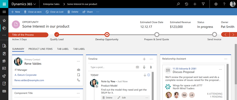
On June 20th Microsoft started taking the cover off its next major release of Dynamics 365 Customer Engagement (formerly known as CRM): v9.0. The biggest announcements in the first day of the Dynamics 365 Preview Executive Briefing were around the client story. With the new Unified Interface (sometimes also referred to as “UCI” for Unified Client Interface/Infrastructure) the plan is to bring a single client technology to cover all the different UI’s across devices. Web, Outlook, Mobile, Tablet.
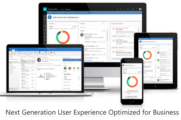
This is very exciting news, but there’s a lot of details and footnotes that people in the Dynamics ecosystem need to be aware of. Let’s dive right in!
Most of you will have probably been around when the previous big UX refresh took place with CRM 2013. We then received the MoCA Framework based tablet app with Windows 8 style tile UI and later saw this framework being used in many other places. We even received a brand new client to be used on the (desktop) web, the Interactive Service Hub (ISH). In fact, one year ago it almost looked like MoCA would be eating the world:
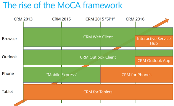
The only problem with this strategy seemed to be that all of these individual parts never formed a sensible whole. Instead, there were so many “seams” visible everywhere you looked in the Dynamics CRM client landscape that many times you just wanted to keep your focus on the traditional web client and wait for things to clear up in these newer areas of the platform. A few examples:
MoCA was born for the mobile first era of touch UI and understandably it didn’t have all of the traditional capabilities from the web client. However, there were plenty of gaps that didn’t make it ideal for mobile use either. One of the biggest issues I had with MoCA was the “configure once, deploy everywhere” principle, which tried to force the same full CRM configuration onto the mobile device screens. MoCA brought the CRM into your pocket, but most of the time what a user would need in their pocket is a simplified app focused on a limited set of tasks. The limitations with MoCA meant that Microsoft had to rely on a Resco based client for their Field Service app in which the use cases are primarily mobile only.
The promise of Unified Interface is that the era of web vs. mobile is over and now we’ll see a UI that’ll both adapt to the device or screen in use, as well as offer the same customization options in each of them. Content will be presented in a way that will reflow into different states of the control as the space available to it changes.
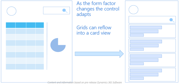
Unlike with MoCA, this time there can be multiple different apps also accessed on a mobile device. Also web-only features like form switching are now available on all devices which makes it far less challenging for the system customizer to design a solution when all the exceptions and limitations of specific client types are (in theory) no longer in the way. It’s important to set the expectations on a realistic level, though, since I’m quite sure we’ll need to make some more compromises on the web side of the house with this new Unified Interface, but hopefully it’ll be a price worth paying for true mobility of Dynamics 365 business apps.
For an even more customized experience, the Custom Control Framework that has been gradually introduced as part of the application (like the Editable Grid, for example) is going to introduce a design surface for developers to extend Dynamics 365 Customer Engagement apps in exciting new ways. Not only that, the existing ASPX based UI controls that have been in the core CRM application since forever are now also being transformed into Custom Controls. This is a part of the larger application/platform separation initiative that’s a whole topic of its own. On a high level, the developers should soon have access to basically the same tools for building new UI controls as what Microsoft is using to build their business apps.
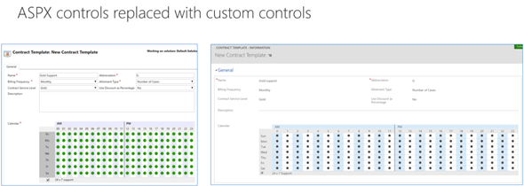
All of this should help in removing many of the gaps that have currently stopped the rolling out of the individual application features in earlier releases for real life business scenarios. There are plenty of promises that MS is making on performance improvements of this new client technology, too. That’s an important aspect to keep in mind and realistically evaluate as the Unified Interface becomes available, since all of the eye candy in the world won’t be of much value if the actual user experience of working with the application isn’t meeting the ever growing expectations of fluid interaction with the data stored in and managed via Dynamics 365.
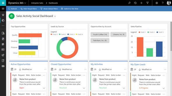
So, all of this looks great – now can we have it by tomorrow, please? The short answer is “no” and the expanded one is “it depends”. As mentioned in my earlier blog post, much of the new features in Dynamics 365 will now be rolled out via Private Previews and Preview programs before general availability. Hopping on to the preview train will shorten the time it takes for gaining hands on experience with the new UI. However, there’s more to it.
Earlier I mentioned the previous UI refresh of CRM 2013 release (“Orion”), but some of you might still remember the intermediate release of “Polaris” (whereas the official name December 2012 Service Update isn’t something even I remembered anymore). That was perhaps the first Online-only release that Microsoft developed, with a target of not even trying to upgrade all of the application features into the new UI concept but instead just a selected few entities (“COLAC”) received the refreshed forms and Business Process Flow. You could build a simple CRM demo for a new customer with it, but trying to upgrade existing systems into Polaris or building anything with more customization requirements was a no-no. They had to wait until the full CRM 2013 release became available.
The reason I’m bringing up this is that initially the Unified Interface is likely to be a bit like Polaris. It’s going to be made available only to brand new instances with the Business Edition licensing, or for new Apps that are either built by Microsoft (Customer Service Hub, a.k.a. ISH v2) or by the customer. It will also be available on the Phone and Tablet apps as well as in the lightweight Dynamics 365 App for Outlook (which officially replaces Outlook Client that’s now deprecated). Everywhere else, though, it’s not going to be the time for Unified Interface yet, but instead a refresh of the web client that’ll look something like this:
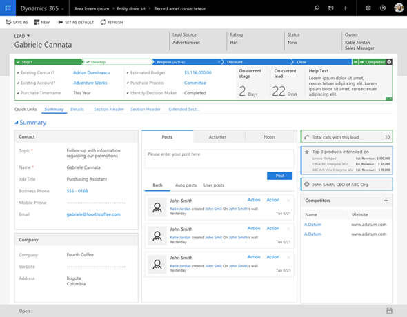
Starting to get confused? I don’t blame you! There’s a hint of irony in the fact that the “Unified” Interface will initially be yet another interface variation for the Dynamics 365 application. I’m sure it’s not the way Microsoft would prefer to have these things introduced but reality is usually a bit more messy than PowerPoint presentations. The new client technology simply represents such a major shift in how Dynamics 365 works that upgrading all the complex customizations of existing Enterprise customers into it in one go would not be a smart move. Remember that “everyone’s an enterprise customer” until the Business Edition finally is out the door.
To truly understand the client strategy that Microsoft is pursuing, you simply have to look at the Business Edition now, regardless of your deployment’s size. It is the dreamy wonderland in which MS can cut back on unnecessary complexity of application features and not worry about breaking any existing deployments, since there is hardly any legacy there. A fresh start that doesn’t need to carry all of the overlapping functionality (like Contracts vs. Entitlements) or provide all the admin options necessary for hybrid environments. It’s not all pure bliss in the sense that all of this will eventually have to live in harmony with the more complex custom UI’s and business logic of big corporations with “non-simplified” CRM systems running on the Dynamics platform. Still, right now we’re seeing a move from “cloud first” to “Business Edition first” when it comes to client innovation.
Just because the Business Edition is targeting the lower end of the product licensing fees doesn’t mean you should dismiss the functionality that is being introduced in it. If the Sales app mainly streamlines many of the unnecessary complexities of current opportunity management in Dynamics 365 Enterprise, then the Marketing app will bring advanced logic like Customer Journey management that many existing larger customers would surely love to get their hands on. Unified Interface is the big story here that’s driving the release policy. I suspect that it’s the primary reason why the new XRM based Marketing app is only available for Business Edition customers initially, since features like integration with Customer Insights based segmentation and scoring mechanisms are not a feature anyone would build solely with the SMB segment in mind.
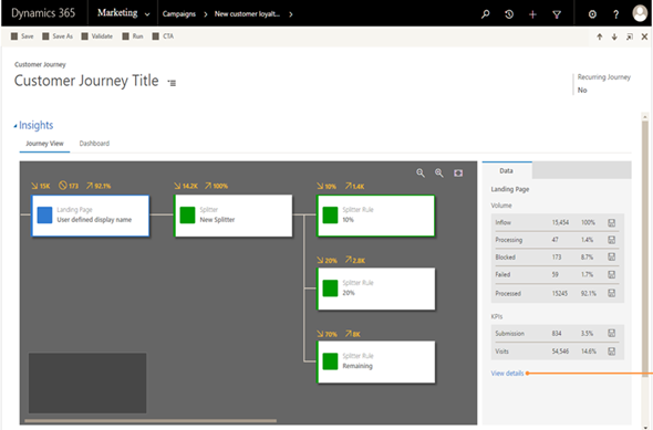
It will all make sense in the end (hopefully), but in the near future both the customers as well as Microsoft will have some work ahead of them before the new promised land of Unification is reached. This is of course not all that different from what other business application platforms with a long market presence must go through every once in a while. Some may claim that Microsoft is following the Salesforce Lightning UI concept here with their Unified Interface and the similarities are surely there to be found. In fact, what I wrote about this the last time when Salesforce was following Microsoft’s lead is still pretty relevant when it comes to user experience evolution, so why not revisit that blog post for some perspective: The Irresistible Force of Great User Experience in CRM Applications.
The Long Road to Unified Interface in Dynamics 365
On June 20th Microsoft started taking the cover off its next major release of Dynamics 365 Customer Engagement
The first step on the unified interface was the CRM 2013 UI – the much-derided horizontal-scrolling menu. Good for touch/tablets, but nearly unusable for Desktop. So, for whom is a unified interface actually a worthy objective? I would suggest for some MS exec who has stated this a goal (for sure), for MS developers (perhaps), but not necessarily for customers.
Great analysis and post
[…] yet, but it does mean that for certain types of users and applications, the interface is changing. Other bloggers have done a better job than I could explaining the “why” behind the UUI. In this post, I want to clear up some misconceptions about what UUI is and who will get it. Read […]
Configuring Custom Controls for Views in Dynamics 365 CE V9
The new Unified Interface that launched in v9.0 of Microsoft Dynamics 365 Customer Engagement gave us
What’s An “App” in Dynamics 365 Anyway?
Everywhere you look you see apps these days. Or more truthfully, you’ve been seeing them for ages
Unified Interface Form Design Notes
It’s been around a year since Microsoft announced that Dynamics 365 Customer Engagement would be